
The Hawk & Aster
太古廣場餐廳
MAG studio以品牌名中的“Aster”為設計靈感,將一朵在路邊盛開的紫菀具象化到空間設計。
MAG studio took the word "Aster" from the brand name as inspiration for the design, embodying an aster blooming on the roadside into the space design.
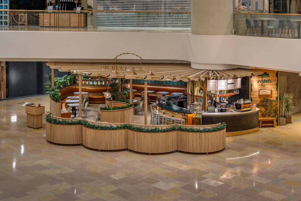
場地位於商場中庭處,如何在只有部分天花和沒有外立面的條件下,打造一個既尊重空間原有特性,又能突出餐廳主體的空間成為本項目的思考點。
The site is situated in the atrium of Pacific Place. How to create a space that not only respects the original characteristics of the mall but also highlights the restaurant is the design challenge that needs the designers to ponder.

Project YEAR
2022
Project Location
Hong Kong
Project AREA
100 m²
Project TYPE
Hospitality Design
兼顧餐廳與水菸吧功能的Bushra,設計師透過燈光將截然不同的兩種環境氛圍以戲劇啟幕與閉幕的狀態表達兩種空間情態。
布幕緩緩落下,燈光亮起,燈燭輝煌的意境是用餐時的氛圍;燈光暗去,一場異國風情的舞蹈表演漸漸顯現,此時已悄然轉換為水菸吧的專屬舞台。
擁有百年歷史的屏風,雕刻的是古老的記憶,串聯過去與現在。
設計師與客人特意尋得擁有百年歷史的雕刻用於空間內,除了增添空間的異域感增加文化在地性外,亦是一種可持續性設計的表達
所有元素似乎都是舞動的動態,水波紋不銹鋼材質的吧台是正在流動的恒河水,輕盈飄動的天花和造型是隨風而動的紗麗,或柔和或流暢或富有節奏,皆為遊走空間的舞步增添了幾分旖旎。
金色的運用呈現流光溢彩的效果,進一步增強了視覺效果和戲劇效果,以顏色的運用傳達熱情的文化屬性。軟裝搭配紅色與其他顏色減輕空間的厚重感,呼應跳脫輕盈的空間屬性。

一方面,MAG studio以“綻放的花朵”為概念聯結客人、品牌與空間,突顯顧客與空間的關系如同品牌名中Hawk(老鷹)與Aster(紫菀)的關系,當顧客踏進這個空間時,就好像老鷹歇腳在一朵巨大的紫菀中。
On the one hand, MAG studio used the concept of a blooming flower to connect the brand, the space, and the guests, emphasizing the relationship between the customer and the zone is similar to the relationship between Hawk and Aster in the brand name. When the guests step into the space, it is like an eagle resting on a giant aster.
另一方面,設計從“紫菀”的形態汲取靈感,用花瓣所代表的流動曲線作為天花的設計語言,花瓣般展開的天花造型不僅解決了原來只有部分天花的問題,還在無形間界定了空間範圍,強化了空間感。
向外伸展的天花,好比花兒怒放,盡力地展開自己的身軀,綻放自己的美,仿佛被風一吹,它就會隨著風翩翩起舞,美不勝收。
On the other hand, the design drew inspiration from the shape of an aster, using the flow curve represented by the petals as the design element for the ceiling. The ceiling unfolding like a petal not only solved the problem of only part of the ceiling but also defined the scope of space intangible and strengthened the sense of space definition.


空間的平面布局以輕松舒適為出發點,強調空間整體的舒適性,因空間有限,設計在空間布局上沒有采取過多的劃分,而是以幾瓣卡座錯落放置分隔區域,動線也因此如花瓣般流動。
Give priority to make the space comfortable. In the layout, the designers did not divide the space into too many areas due to the limited area, but instead used the circular shape to create several semi-private group seats, which were scattered to divide the restaurant, and the motion line thus flowed like petals.
在流行早C晚A(早coffee晚alcohol)的時代,吧台不能僅限於單一的功能,流暢生動的吧台兼顧了酒與咖啡的功能需求,在有限的空間內創造最舒適的、可以滿足各時間段不同就餐需求的場域,吧台拐彎處的弧度自然的分割了兩個操作區,如品牌名中的“hawk”與“Aster”,柔與烈也同時存在於這個空間內。
In the era of Coffee for morning and Alcohol for evening, bar counters cannot be limited to a single function. The bar counter takes into account the functional requirements of alcohol and coffee, and the curves of the bar corner naturally divide the two operation areas, creating the most comfortable field in the limited space, which can meet dining needs at different times.
